As a florist, your logo communicates who you are and what your business is. Everything from the font to the style of the emblem to the layout. As you develop your logo, you are establishing a brand that your clients can connect with and, more importantly, a brand that feels similar to the brands they already trust. It's so important that clients have a consistent brand experience from your wedding florist website to your floral software for proposals.
As you aim to develop a visual identity that is as unique as you are and market your business, keep these 4 keys to the wedding florist logo in mind.
Key 1: Simple
Far too often, businesses--especially small businesses--try to develop a unique logo by making it busier than it needs to be. They add a variety of visual elements that may look good, but do not help distinguish them from every other business on the block. Often, the busier the logo, the less professional it looks and the more likely potential clients are to turn away before ever seeing the quality of product that can be delivered.
Logos should be kept clean and simple in order to be recognizable, timeless, and versatile. When a logo is simple and memorable, people can easily recall what it represents, which is key to surviving in such a competitive market.
This logo from Brianna of Fox & Fern Floral is an excellent example of how elegant a simple design can be.

Key 2: Versatile
You'll want to use this logo multiple places. One of your tasks should be to identify every place your logo will be used. Every. Single. Place. Business cards? Website? Your wedding florist software proposals? Pull up your note app or a sheet of paper and list these out. Your final design should be legible in the smallest and largest of presentations. A logo that is too vertical or horizontal will become difficult to read when enlarged or reduced in size. It doesn’t matter how amazing your logo looks if it cannot be easily seen.
This logo from Hannah Walker's Bride and Bloom is a great example of versatility as the emblem can be easily used and recognized in every format, even images as small as a favicon.
 To ensure versatility, a logo should be designed in vector format. This will ensure that the logo can be scaled to any size without compromising image quality. A good tip is to use Adobe Illustrator to design your logo, not Photoshop.
Worried that your new logo might not be very versatile? Download our logo checklist to analyze everywhere it might go before it's designed!
Key 3: Style Matches Your Target Audience
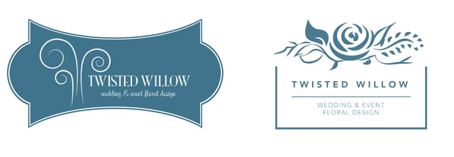
When Rachael and I started Twisted Willow, we hired a professional branding company to develop our first logo. They created an absolutely beautiful logo design that fit the initial clients we worked with. As we began to shifr our company focus, it connected less with the higher-end clientele, which was where our company was going. It was time for an overhaul of this florist’s logo. The new logo, on the right, immediately allowed Rachael to start connecting with the clients she wanted.
 Every aspect of your wedding florist logo needs to be geared towards your target audience. If your target audience members are high-end brides, your florist logo should not include overly bright colors, a “fun” font, or an emblem that screams “DIY.” However, if your goal is to help clients with more intimate budgets develop beautiful floral arrangements for their special day, you may be able to have a logo that is a bit more whimsical. Whatever your target audience, it is important to know what design elements will resonate with them before you develop your logo.
Key 4: Single Color

________
What is Curate.co? It's a proposal creation software made specifically for florists to help ensure they're making quick, beautiful proposals while still being profitable. We're giving away our Logo Placement Planning Guide to help you consider everywhere your logo may go and maximize your brand exposure.
Want to learn more about Curate?


