Your website is the gateway to your company, providing the foundation for your marketing. Wedding florists with a great website will engage the engaged and help them see that they're trustworthy, stylish, and want their business. At our wedding florist in St. Louis, we have found remarkable change in connecting with clients by looking at the best florist website design. We've also found that conversion rates skyrocket when you make a few simple changes to your wedding florist website.
We've looked at around 800 wedding florist websites in the last few weeks and here are 4 great examples of the best florist websites to give you inspiration! We're working off the general design and usability on these sites and in future blog posts on florists websites we'll address things like SEO.

Wilder Floral Co (Wedding + Retail)
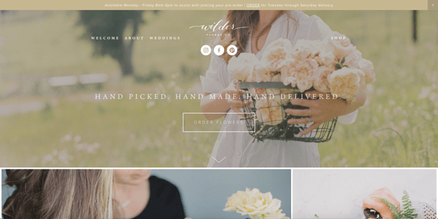
We'll start off with one of our favorites. Wilder Flower Co has the absolute best take we've seen of beautifully combining a wedding florist website with a retail florist site. They have limited menu options "above the fold" (what website visitors first see when they load the page) and a very clear call to action. When you scroll, you're immersed in gorgeous floral photography but every photo has a call to action associated with it. There's never a moment where you have more than 4 photos in front of you - which means that at any point in the site, you have four options to choose from. Their site has an incredible balance of beautiful, functionality, and driving the customer to the end goal.

Bloom In Blueprint (Events Florals + Design + Planning Company)
As soon as your page loads on Bloom In Blueprint, you're immersed in gorgeous color photography lavished in blooms. If you're going to pull off having a single photo on your page load, do it like BIB. They used a photo that completely sets the tone for what kind of events that potential clients can expect. They have a beautiful one-page site that is a simple, hip, and minimalist design. They also have a very simple explanation of who they are and, most importantly, they emphasize how they will help their clients.
Want to make the most of your website traffic? Download this guide to increase your web inquiries by 400%.

Loluma (Event Florals + Design + Planning)
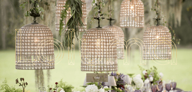
If you've yet to pick up on it, we are absolute fans of florists who can immediately set the tone for their visitors. The average visitor spends 15 seconds on your site before high-tailing it so you need to be impressive up front if you want them engaged. Loluma does just that with beautiful hanging lights covered in various complementary euc with a beautiful backdrop of an array of floral arrangements. They also provide clear request to move to the next step ("Enter") but take it beyond that by allowing visitors to simply scroll to the entrance.

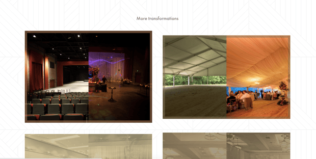
One absolutely stellar functionality that they've built is the transformation tool where users can scroll over before and after for certain venues. That page alone could sell any client that it's within their abilities to transform dull venues into show stopping affairs. Their lookbook is a tremendous way to curate photos as well.

Amanda Joy Events (Weddings-Focused Site)
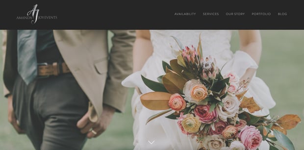
Amanda does a tremendous job with her site at creating a dark and beautiful feel at the same time as portraying that her clients will be working directly with the owner of the business. It's a beautiful front page with few links to help guide the brides in the direction she'd like them to go. She has a spectacular call to action on her site by just calling it "Availability." This is a little bit like our suggestion of using "Check My Date" in our other florist website blog post - yet, she has her own flare on it. At the bottom of every page, she has a single call to action that gently guides the reader to the next place they should go.
We hope these provide some inspiration if you're looking at improving your site and we love that there are florists have spent time to build things into their site that are uniquely them. Keep an eye out for more posts that will help you along on your website!
------
Want to make the most of your website traffic? Download this guide to increase your web inquiries by 400%.


