

As a caterer, your logo communicates who you are and what your business is. Everything from the font to the style of the emblem to the layout. As you develop your logo, you are establishing a brand that your clients can connect with and, more importantly, a brand that feels similar to the brands they already trust. It's so important that clients have a consistent brand experience from your website to your catering software for proposals.
Table of Contents:
- What should you keep in mind for catering logo design?
- Keys to a great catering logo
- Catering Company logo questions
- Catering business logo summary
What should you keep in mind for catering logo design?
In the bustling world of catering, where first impressions can make or break your business, an eye-catching logo is a powerful tool. Your logo is more than just a pretty picture; it's a visual representation of your brand story and a cornerstone of your marketing strategy. Whether you’re a new entrant in the food industry or looking to refresh your brand, a well-designed catering logo is a crucial step in establishing a brand identity that resonates with clients and sets your business apart in a competitive market. A well-crafted logo should be simple yet memorable, avoiding overly complex elements that can detract from its professional appearance. It must also be versatile, capable of being effectively used across various mediums and sizes, from business cards to large banners, without losing its clarity or impact.
Ensuring that the style of the logo aligns with the target audience is essential; for instance, an elegant design might appeal to high-end clients, while a more playful logo can be an excellent choice to attract budget-conscious customers. Additionally, a single-color logo can enhance versatility, allowing it to be used in diverse formats such as monochrome printing and embroidered merchandise. By focusing on simplicity, versatility, audience alignment, and single-color design, catering businesses can create a powerful logo that communicates their brand’s values and appeals to their desired clientele.
Keys to a great catering logo

As you aim to develop your brand's visual identity that is as unique as you are and market your business, keep these 4 keys to the perfect catering logo in mind.
Key 1: Simple
Far too often, businesses--especially small businesses--try to develop a unique logo by making it busier than it needs to be. They add a variety of visual elements that may look good, but do not help distinguish them from every other business on the block. Often, the busier the logo, the less professional it looks and the more likely potential clients are to turn away before ever seeing the quality of product that can be delivered.
Logos should be kept clean and simple in order to be recognizable, timeless, and versatile. When a logo is simple and memorable, people can easily recall what it represents, which is key to surviving in such a competitive market.
This logo from Sugar Beach Events of Hawaii is an excellent example of how elegant a simple design can be.

Key 2: Versatile
Your logo is a key element of your brand awareness strategy. It should be versatile enough to work across different marketing mediums, from business cards to social media profiles. An effective logo is not only visually appealing but also memorable. It should make a lasting impression, helping potential clients recall your brand easily. You'll want to use this logo multiple places. One of your tasks should be to identify every place your logo will be used. Every. Single. Place. Business cards? Website? Your proposals? Pull up your note app or a sheet of paper and list these out. Your final design should be legible in the smallest and largest of presentations. A logo that is too vertical or horizontal will become difficult to read when enlarged or reduced in size. It doesn’t matter how amazing your logo looks if it cannot be easily seen.
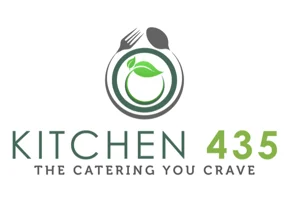
This logo from Kitchen 435 is a great example of versatility as the emblem can be easily used and recognized in every format, even images as small as a favicon.
To ensure versatility, a logo should be designed in vector format. This will ensure that the logo can be scaled to any size without compromising image quality. A good tip is to use Adobe Illustrator to design your logo, not Photoshop.
Worried that your new logo might not be very versatile? Download our logo checklist to analyze everywhere it might go before it's designed!
DOWNLOAD OUR LOGO PLACEMENT PLANNING GUIDE
Key 3: Style matches your target audiece
Every aspect of your event catering logo needs to be geared towards your target audience. If your target audience members are high-end brides, your logo should not include overly bright colors, a “fun” font, or an emblem that screams “DIY.” However, if your goal is to help clients with more intimate budgets develop delicious menus for their special day, you may be able to have a logo that is a bit more whimsical. Whatever your target audience, it is important to know what design elements will resonate with them before you develop your logo.
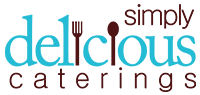
We love how this logo from our friends at Simply Delicious Caterings resonates with their target audience perfectly.
Key 4: Single color
Keeping your logo to a single color forces you to look at the effectiveness of the overall concept and shape of your logo rather than considering how much “better” it would look in a different color. This is the ultimate test of a logo’s strength and versatility.
A good logo will also use negative space as a type of additional color to keep the design interesting and dynamic. While the logo can use multiple colors, the core shape should still lead to looking great in situations where only one color can be used. This means the logo should be very carefully designed to make sure its detail does not disappear on smaller screens. Having a single-colored logo prepares you for one-color printing for business cards, letterhead, packaging, and black and white copies. It also frees you to create rubber stamps, foil-embossed labels, embroidered merchandise, and laser-cut products.
While you could choose your favorite color, you need to do anything with caution as certain colors will resonate within different communities and different client demographics than others. The color you choose should be carefully selected to resonate with your target audience and be selected to optimize the level of trust between yourself and potential clients.
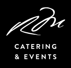
This logo from Morin's Catering and Events is a terrific example of a single-color design that resonates well with their target audience and can be used in a variety of ways.
Catering company logo questions:
How do you make a catchy logo for my catering business?
In the competitive food industry, an eye-catching logo is a powerful tool that can set your catering business apart from the rest. This visual emblem is more than just an artistic element; it’s a crucial part of your brand story and marketing strategy.
To create an eye-catching logo you need to think about makes your catering service unique. Are you known for luxury events, casual picnics, or organic menus? Your logo should reflect your catering niche.
How do I advertise myself as a caterer?
To effectively market your catering business utilize social media. Use platforms like Instagram, Facebook, and Twitter to showcase your services, share customer testimonials, and post high-quality photos of your dishes and events. Leverage your logo for brand awareness. Consistently use your eye-catching logo across all marketing mediums to create a cohesive and recognizable brand image. Create a well-designed website that features your logo prominently can attract and inform potential clients. Include a portfolio of past events, a menu of services, and contact information.
Lastly, you can also participate in community events, food festivals, and farmers’ markets to increase visibility and build relationships with potential customers.
How do I come up with a catering name?
Choosing the right business name is crucial. Your name should hint at the type of catering service you provide. For example, “Elegant Events Catering” suggests high-end, sophisticated services. Keep it simple and memorable. A short, catchy name is easier to remember and can have a stronger impact. Ensure the name is not already in use by checking business registries and domain availability for your website.
Where do I get a catering logo or catering logo template for free?
If you’re looking for a free catering logo maker, logo templates websites like Canva, Adobe Spark, and LogoMakr offer free templates that you can customize with your business name and different colors. Platforms like Dribbble and Behance often have free resources and inspiration shared by professional designers.

Catering business logo summary

While developing a logo for caterers can be a daunting task, the best logos observe these principles and have seen tremendous success in doing so.
Creating a successful catering logo involves clear communication of your brand through design. As you build your visual identity, consider these four essential keys:
- Simplicity: A simple, clean logo is more professional, recognizable, and memorable. Avoid overcomplicating the design with too many visual elements.
- Versatility: Your logo should work across all mediums and sizes, from business cards to websites. Design in vector format to maintain quality at any scale.
- Target Audience Alignment: The logo’s style should match your target audience's preferences. High-end clients may prefer elegant designs, while a more whimsical logo might suit a budget-friendly clientele.
- Single Color: A single-color logo emphasizes the core shape and ensures it looks good even in monochrome formats. This approach is versatile for various applications, including business cards and merchandise.
Following these principles will help create a strong, effective great logo that resonates with clients and stands out in the competitive catering market.
Curate is the platform for full-service catering companies that saves time on the proposal process and helps increase bookings. Unlike Word documents and PDF invoices, Curate elevates the client experience with modern technology and interactive proposals.