What makes the best florist website design?
When Rachael and I started Twisted Willow Design, we wanted to get up a quick website and branding to get started - knowing that we would need to redo it in a couple years once we had a better sense of who we were as an event floral company.
We knew our site needed a bit of work to fit our vision of catering to brides so we brought in a team of professionals who started the redesign process by looking to see what the best in the business were doing. The results have increased our wedding website conversions dramatically!
Here are four things we learned from that study that you should consider to enhance your website and some examples of how each lesson can be applied to your website.
Be Mobile-Friendly
In a world where people access the internet more from their phone than their computer, being mobile-friendly is incredibly important. That means that the user—your potential bride — must have as great of an interaction with your beautifully designed website from their phone or tablet as they would from their computer.
Ara Farnam-Levinson of Rock, Paper, Scissors has a great landing page on both her mobile and desktop visions that encourages site visitors to engage with it by clicking to enter it. The mobile site is also very simple to navigate and the left-right scrolling through portfolio items makes it easy for a visitor to feel a connection to the florist.
Alyssa Griffith of Rose Gold Events' mobile landing page is also very simple—featuring a slide of some of their work and a few key links for visitors to click on. The menu option is clearly marked at the top of the page and out of the way of the page content when opened, meaning visitors can enjoy the full experience of the page even while contemplating which page to check out next.
Have only a few links
Many brides are overwhelmed with the million options they have when planning their wedding. Pinterest boards that provide inspiration overload are less than helpful here. The worst thing you can do on your website is have a potential client be unsure of where to click because you have too many links.
Download our quick guide to increasing your web inquiries by 400%.
Kaci Muller of Damsel Floral Co. does a tremendous job of solving this by using a one-page design here there ARE no menu links. Brides visiting her site have no confusion about what to do: just scroll. Does this mean her website is simple? No. The label on each item appears as one scrolls over it and allows the user to see a portfolio of those options.
Kim Davies of Victoriana Floral also does a fantastic job in providing a few limited options for the prospective client to peruse. Their “Look Books,” which are divided into 7 themes, allow the bride to see some of her options up front while offering a small sample of their work.
Which brings us to the next important part of a florist’s website...
Show examples of your work
A bride looks for three things when she is trying to book a florist: one she can like, one she can afford, and one she can trust. The first she will decide from your website is that she can trust you to get her style. You can give a bride a good sense of your style by providing a portfolio that features a wide range of your creative abilities.
Daphne Ashby of Ashby Floral Boutique does a marvelous job of showing her work, both in a drop down menu of specific design arrangements and in showing her featured weddings. By showing actual weddings, she helps give brides a whole sense of what she can provide for their wedding.
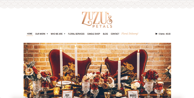
Magda Sobieski of Zuzu’s Petals' portfolio is nicely divided into seasonal categories. This works great to help the bride see their style as it specifically relates to the day she is planning. If a bride has yet to set her date and is deciding whether to have it in one of two seasons, this presentation format could help her make the decision.
Download our quick guide to increasing your web inquiries by 400%.

Consistency In Style Across the Site and Business
Far too often you see websites whose style fails to line up with the florist’s style or the type of clients the florist wishes to attract. It is important for your website to have a style that is consistent with your own and serves as a true reflection of who you are.
Heather Ann Miller of Eclectic Sage and Gina Thresher of From the Ground Up Floral are both known for their very contemporary style and that is definitely reflected in each of their websites from the layout to the fonts used. When someone visits their sites, they immediately understand how their styles are different from other local florists, even before they see their portfolios.
What are some other important features of florist websites? Comment below!
-----
Looking to get the most out of your website traffic?
Download our quick guide to increasing your web inquiries by 400%.

